The appy Wanderer
Finding the painting before you paint it
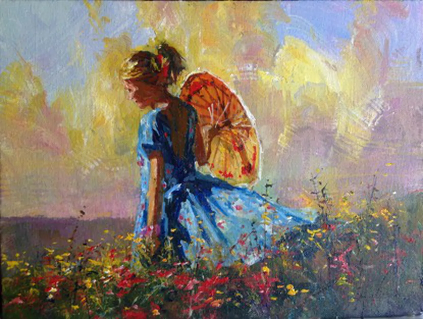
The picture begins long before the first brushstroke. I start by assembling the ingredients: a light, airy sky; a flower-filled foreground; the right slope of the ground; and a figure with enough movement and personality to carry the whole thing.
The downward slope immediately appealed to me. The walking girl would fit perfectly there – and better going downhill than uphill. I wanted the foreground alive with bubbly colour, spiky stems and flower shapes, while the sky stayed light, pleasing and supportive.
The figure supplied the narrative. The umbrella is askew, the circular shape is strong, the yellow sits beautifully against the blue dress, and the blond hair with its red ribbon gives the whole subject lift. More importantly, there is an emotional connection: summer day, sunshine, cool grass – perhaps your sister, cousin, daughter, or even yourself.
The Ingredients
Three references, one painting

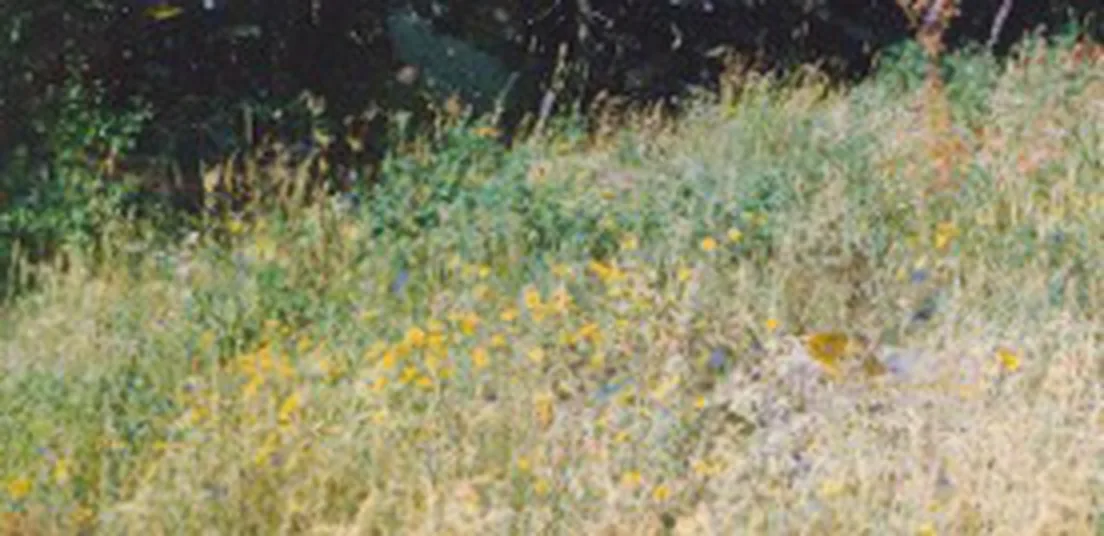
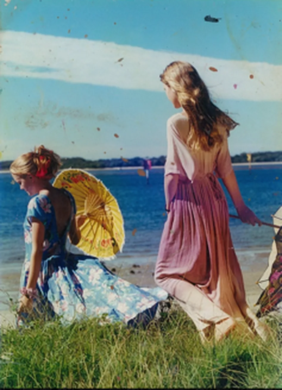
Building Good Order
Composition, values and the supporting sky
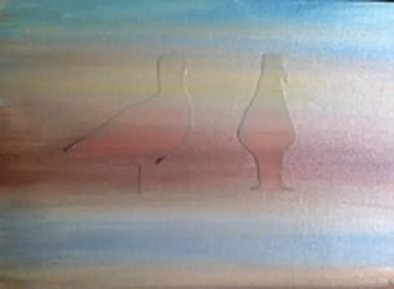
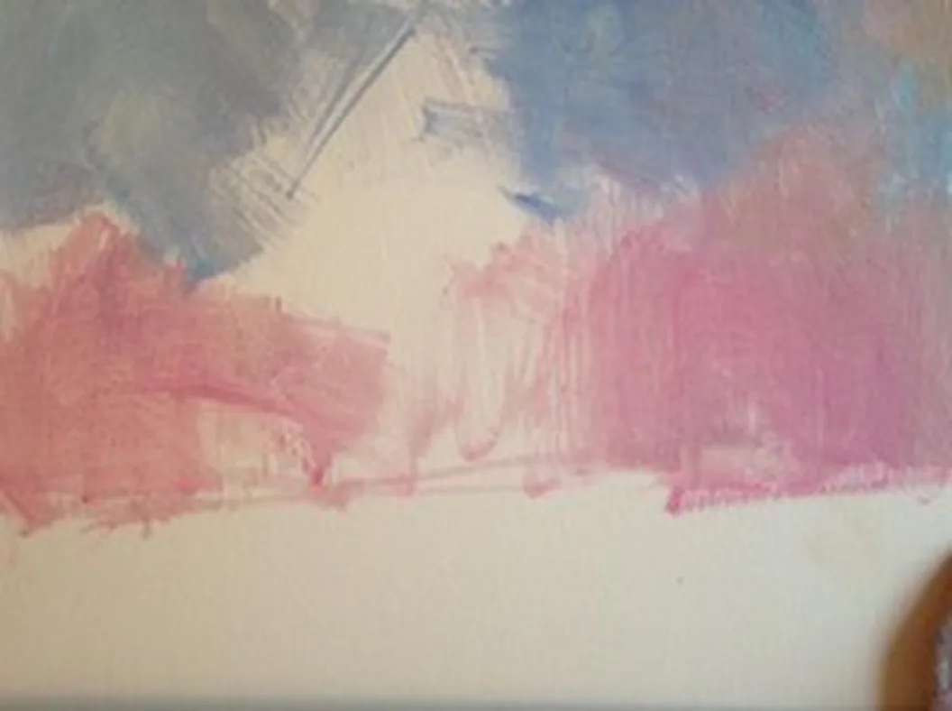
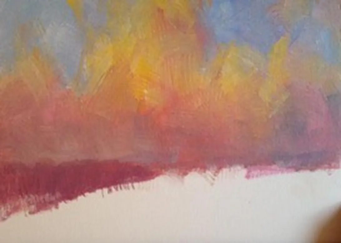
The composition is essentially two large parts – foreground and sky – with a small supporting band to suggest distance and bridge the colours between them. The grass intersects the dress about one-third of the way up, while the clouds balance the remaining space.
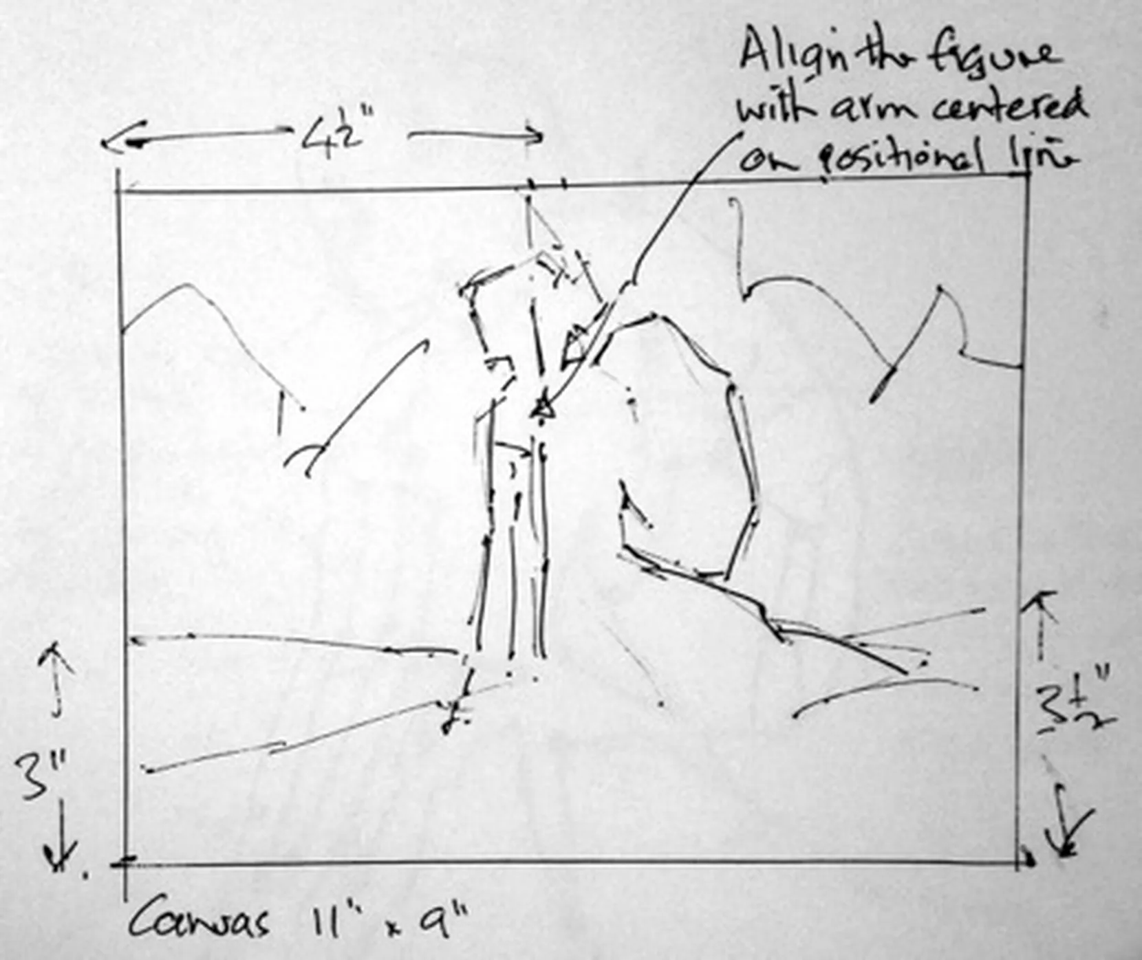
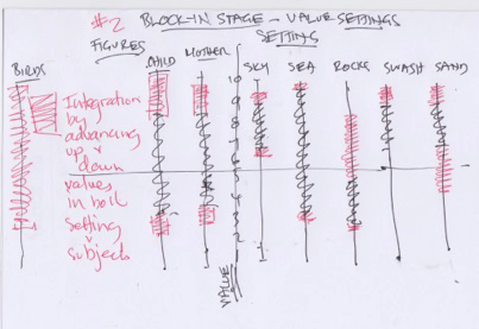
Balance is not fixed at the beginning. Every part is adjusted as the painting develops. My Value Integration Graph is simply a way of keeping the picture ordered while the parts change.
Keep asking: does this part help the figure, or compete with it?
- Cobalt Blue
- Cadmium Yellow Pale
- Permanent Rose
Light, Dark & Local Colour
Separate the value pattern before adding detail
Once the sky and foreground are in place, the figure is no longer a blank silhouette. Before painting into it, I mark the points where dark meets light. Some edges break sharply; others melt through a transition. The purpose is simple: fewer guesses and fewer mistakes.
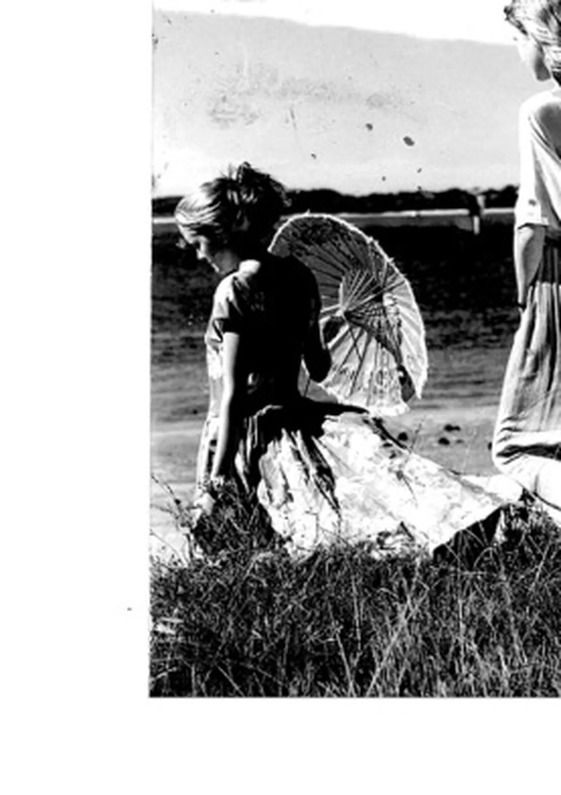
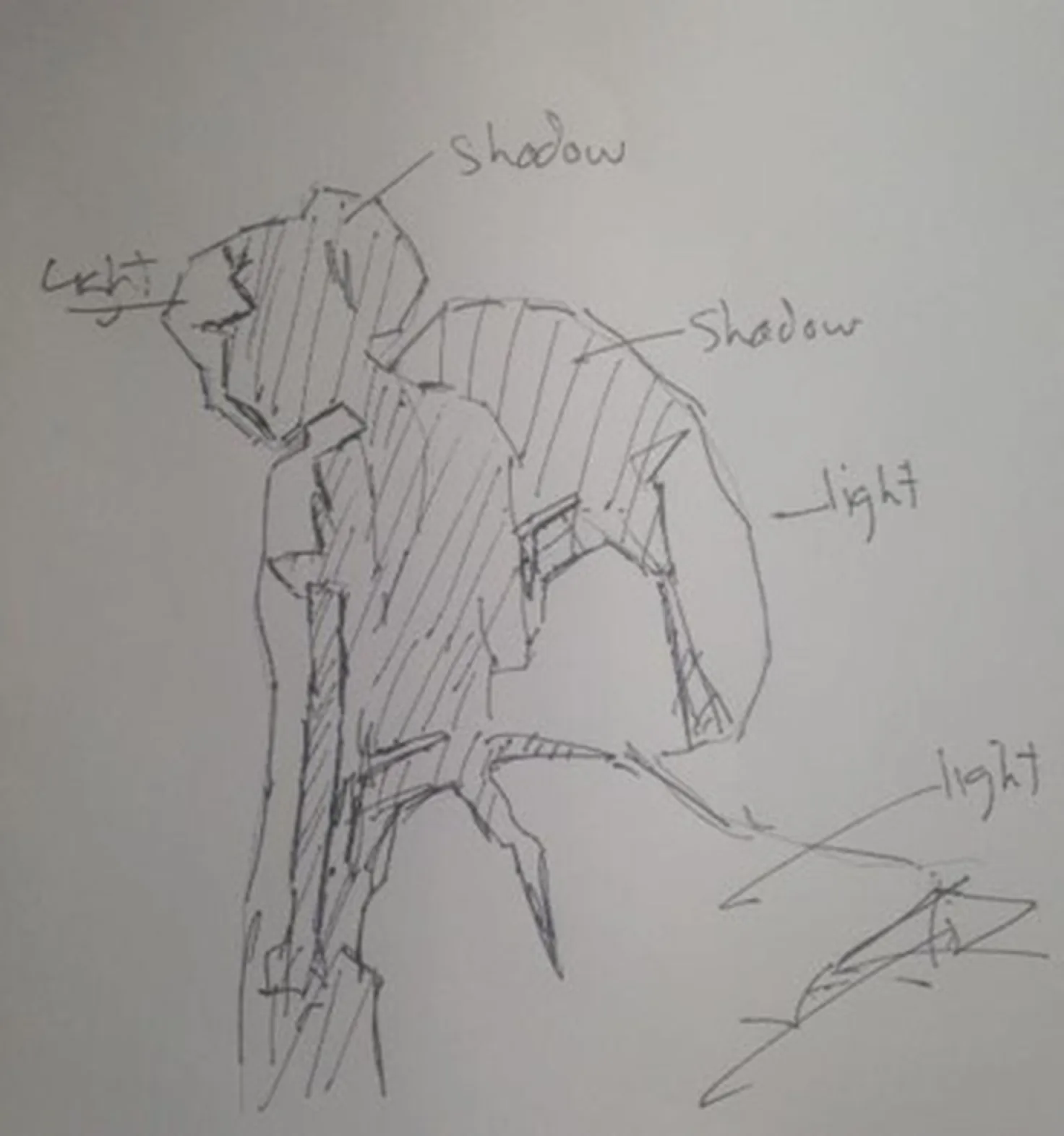
Then climb the value scale gradually. Lay in the general colour, find the next step lighter, then the next – still keeping the paint comparatively thin.
The brightest notes become fewer and fewer as the value rises, until there may be only one or two final clicks of light on the dress, hair, arm or face.
Start with local colour. The dress is blue, so the shadow begins with blue, then is darkened to the correct value. White flowers need a darker blue-grey in shadow rather than straight white.
Ten Feet Away
Where the painting finally tells you what it needs
As the figure develops, the grass, stems and flowers develop with it. The foreground rises step by step in value, while the sky may need a few brighter notes to bring figure, foreground and sky into the same conversation.
The key at this stage is not to sit in front of the canvas. Walk back about ten feet, close one eye and squint with the other. At that distance the scattered details collapse into the larger statement, and you can suddenly see where a touch of colour, light or dark is missing.
That is the viewing distance that matters. A painting hanging on a wall has to work from across the room, not merely from eighteen inches away.
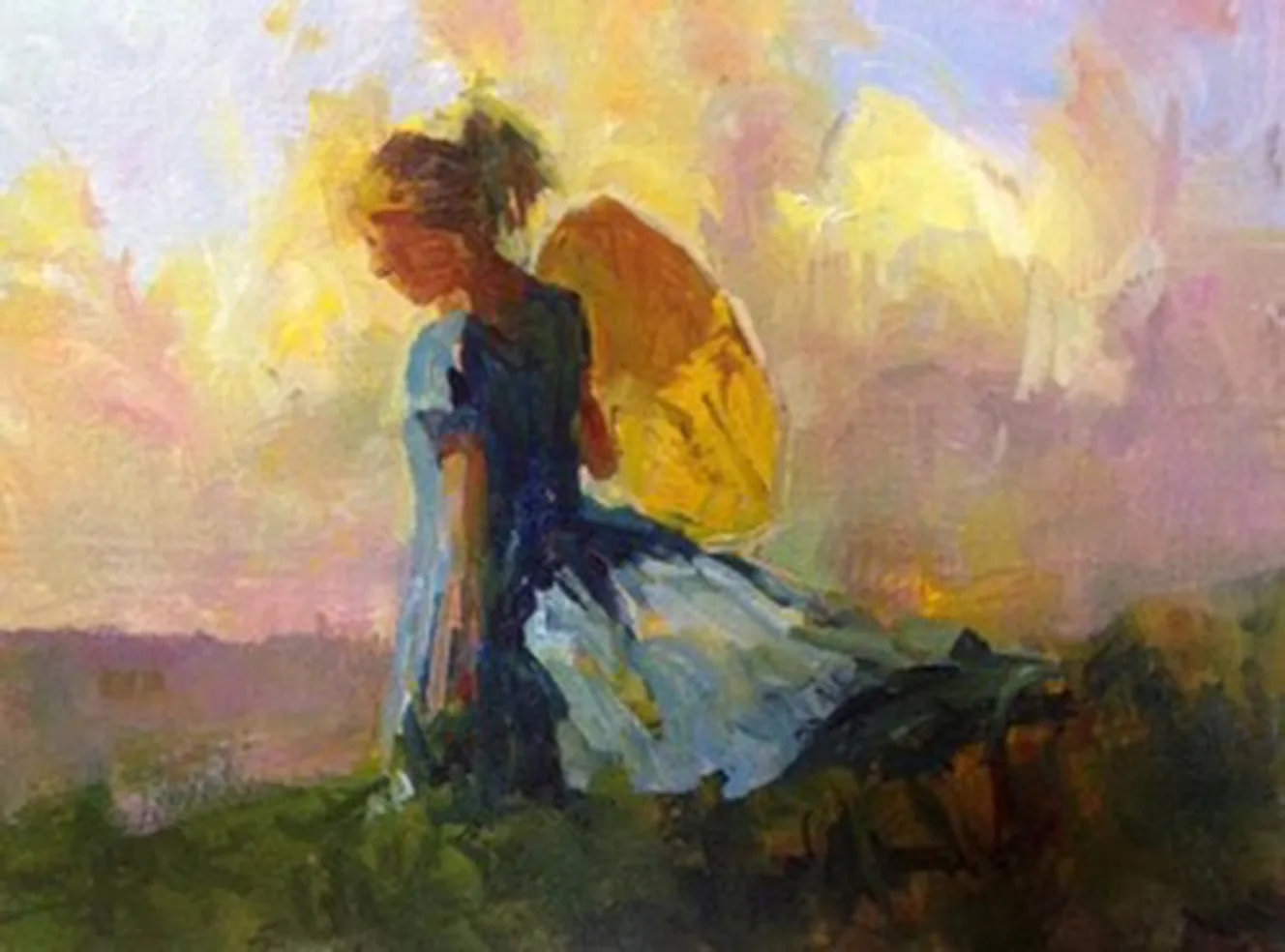
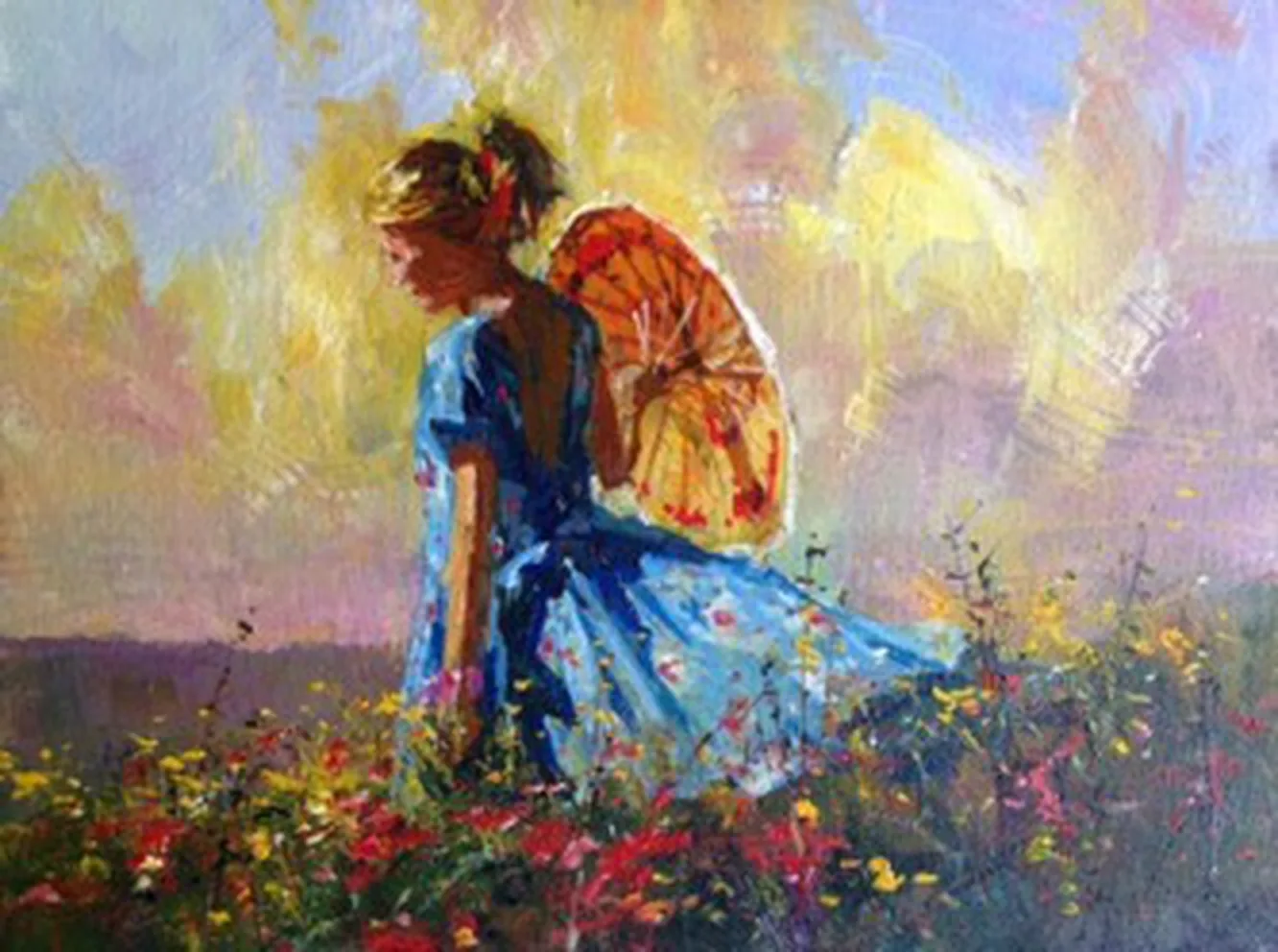
The final stage is selective: enough adjustment to make the whole picture robust and irresistible, but not so much that the freshness disappears.